Tuesday, January 25, 2011

Individual Project 1

DUE TUESDAY, FEBRUARY 8


Please apply your knowledge of the elements and principles of design to a work of art in
the College Gallery. Describe how each is present in the work, and its relationship
to the painting/sculpture as a whole.


Your explanations for each element and principle should contain at least 2-3 well-written sentences per bullet point.

Elements of Design:
• Line:
• Color:
• Shape / Volume:
• Texture:
• Illusion of Space:
• Illusion of Motion:

Principles of Design:
• Unity:
• Emphasis / Focal Point:
• Scale / Proportion:
• Balance:
• Rhythm:

Summary:
• Use your depth of understanding of color and design to interpret a particular point of view regarding this work of art. How do the elements and principles work together to create a particular feeling or message?


Photobucket


Fernando Botero, Mona Lisa. 1977. Oil on Canvas, 6'x5'5" (page 75)

Elements of Design:
Line:
Line is a minimal element of design in this piece, which largely is composed of soft, subtle gradations of form. There are delicate lines that do appear, such as the lines that articulate the expression of the Mona Lisa, or the line that establishes the presence of the veil across her forehead, but they remain subtle and muted and do not demand immediate attention.

Color:
The colors in this piece are very muted and quiet warm earth colors. They are mostly tones, tints and shades of a red-earth hue and a slightly cool grayish sky. There are no fully saturated hues, the color is understated and does not demand critical attention. Black is more dominant than any specific hue, and it frames the face of the figure as well as creating a strong positive shape.

Shape / Volume:
The shapes Botero employs are largely organic and biomorphic. They express a physique that is volumetric and appears comically inflated. There is an element of distortion as the figure becomes abstracted and simplified into it's whimsical dimensions. As such, there is little naturalism or realism as the Mona Lisa is here re-imagined as a rather corpulent fantasy in the artists own imagination. He has created an ideal figure, but one that may not overlap with the ideals of Hollywood or the runways of NY and Milan.

Texture:
The implied textures articulated by the paint are soft and smooth. Although the work does not "fool the eye" like many trompe l'oeil oil paintings, it nevertheless alludes to and suggests a smooth and unblemished face as well as the delicate surfaces of fabric and fine hair. The work demonstrates softness in texture as well as in light and color.

Illusion of Space:
Space is broken down into 2 primary areas in this piece: the large figure of the foreground that is closest to the viewer, and the landscapes that moves into the distance-barely visible around the inflated shape of the Mona. Mountains that sometimes resemble pears or other fruits receed and diminish in space according to the laws of linear perspective. Atmospheric perspective causes these landscape elements to lose contrast and become faded as they regress towards the horizon line. The viewer's eye largely remains in the foreground, however, as the central figure carries much more compositional weight than any other picture element.

Illusion of Motion:
There is no illusion of motion in this piece, the central figure appears static and unmoving. The central placement is largely responsible for this, and the spatial elements discussed above add to the motionless quality of this work.

Principles of Design:
Unity:
The simplicity of the composition is the main design element that contributes to unity in this work. The viewer is meant to focus on some very subtle adjustments in scale and proportion that Botero has made to Da Vinci's original work, and the overall impression is one of restraint and sobriety. There are no whirling rhythmic lines or dissonant colors to reign in with unifying techniques, so the portrait format itself does much of the work in achieving a unified composition.

Emphasis / Focal Point:
Our eye moves first to the wry expression of this re-imagined Mona Lisa, and then to her strangely proportioned sausage hands that somehow seem delicate. The other picture elements act largely to frame our examination of this oddly proportioned face, and emphasis is created to push the focal towards the delicate facial features and the hands.

Scale / Proportion:
Botero is famous for his unusually scaled and proportioned figures, and this slightly amusing/disturbing adjustment is what gives this piece it's power. The Mona Lisa we are meant to consider is morbidly obese with comically small facial features and a plump cartoon body. Strangely these adjustments in scale add a comic effect rather than repel or disgust. The distortions in scale cause one to question the very premise of the face and figure as an organizational gestalt of separate elements as we begin to focus further on the absurdity of each feature.

Balance:
The piece is well balanced as it utilizes the portrait format to emphasize the bi-lateral symmetry inherent in all human subjects. The figure is faced slightly to the left, but holds our gaze with a forward view. By cropping the body as it exits the picture plane, the artist has created a solid and stable mass to plant his robust figure upon. There is an easy solidity and inert balance that feels very earthbound and does not suggest asymmetry, isolation, or motion.

Rhythm:
The primary rhythmical element can be seen in the background: the pear like hills that pop up regularly as the horizon stretches into space. The repetition is regular and not overwhelming. Additionally the waves of Mona's hair add a slight sensation of rhythm as we consider the figure.

Summary:
Use your depth of understanding of color and design to interpret a particular point of view regarding this work of art. How do the elements and principles work together to create a particular feeling or message?

Botero uses clever and skillful distortions of scale and proportion to challenge our idea of Da Vinci's original masterwork. By appropriating the painting and adjusting it according to his whims, he asks us to reconsider this art-historical icon in a new and unusual context. Botero is able to create a subtle and delicate figure that teeters on the edge of farce, yet somehow remains compositionally solid enough to be taken seriously. The quiet color, smooth textures, solid balance, and gentle gaze are all a demonstration of good design principles that contribute not only to a unified piece, but engage the viewer on an intellectual level as well.

Photobucket
Photobucket
Photobucket
Photobucket

Photobucket
Photobucket
Photobucket
Photobucket

Honors Project: Contemporary Interpretation


Covers and Citations

Thursday, January 20, 2011

NEW GROUP ASSIGNMENTS

Mistresses of the Dark Lord Savonarola
Jennifer Becker
Samantha Kuharcik
Christina Hansen


Napoleon in Exile
Samuel Hoarfrost
Anika Bethel
Derminga Bruneau


Caravaggio's Dream
Ava Funk
Rebecca Ireland
Brandon Parker

ART CRITICISM


Photobucket


Thursday, January 13, 2011

Group Project 1


Iconography
Group Assignment 1 100 points


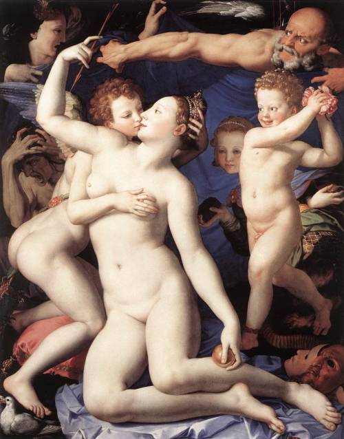
Please refer to the image provided for this assignment.

1. Figure looking in distress at the revealed scene.
2. Figure in anguish.
3. Winged boy caressing figure 4, stealing crown.
4. Woman stealing arrow from figure 3, associated with the dove and golden orb.
5. Old man with wings, hourglass, wielding the blue cloth.
6. Half-monster figure with backwards hands and honey-comb.
7. Small boy with flowers.
8. Masks

In small groups please discuss the 8 picture elements listed above and their possible symbolic or allegorical meaning. For each item describe what you think may be a plausible explanation. Please write at least two sentences for each item.

In a final paragraph of at least 6-8 sentences, put all the pieces together and describe how the narrative functions in a totality. What is the message or moral of the allegory? How do the figures relate to larger themes or ideas that they may represent? There is no wrong answer, but your explanation must be plausible and show a sufficient amount of inquiry and explication.

Please do not look the image up. Obvious cheating in this regard will be penalized!
If you are already familiar with the image please notify me in advance.

Please hand in one copy for the entire group with all names listed.
Although there will probably only be one typist, you must all make contributions. It is highly advisable to obtain respective e-mails so that the assignment can be proof-read by all group members.
Poor grades are not a reflection of the typists contribution, since you all must approve your assignment before handing it in.


Objectives:
• Demonstrate understanding of the use of symbols and allegory in iconographic images.
• Demonstrate understanding of historical context and its relationship to form.
• Demonstrate understanding of theme.

Thursday, January 6, 2011

My Office Hours Spring 2011

Monday: 8:30-9:30 am
Tuesday: 8:30-12:30 am, 2:30-3:30 pm
Wednesday: 8:30-9:30 am
Thursday: 9:00 am-12:00 pm

AA 107
Do not hesitate to visit for any questions, concerns, clarifications, etc.